Two photographers stand at the same pond, same light, same heron. One comes home with a record shot — a sharp bird, dead center, against a busy bank of reeds, the kind of frame you scroll past. The other lies flat in the mud, waits for the heron to turn its head, and comes home with a photograph people stop on. Same gear. Same bird. The difference is composition — the set of decisions about where the animal sits in the frame, what surrounds it, and what the picture is actually about.
Here's the honest short version, the answer to how to compose wildlife photos before we get into the why. Get to the animal's eye level. Keep the eye tack-sharp and make eye contact whenever the animal gives it to you. Pull the subject off-center and leave more space in the direction it's looking or moving. Hunt down a clean, non-distracting background by changing your position, not just your aperture. And decide, every time, whether you're making a tight portrait or a wider shot that puts the animal in its world. Almost everything else is refinement.
One thing to hold onto from the start: these are guidelines, not laws. Nearly every working pro who teaches composition says the same thing in their own words — learn the rules so you know when breaking them makes the picture better. We'll treat them that way.
Same gear, same bird — the photograph people stop on is the one where every decision about the frame was made on purpose.
Composition is the decision the gear can't make for you
Strip composition down and it's simple: it's how the elements in a frame are arranged, and how you guide the viewer's eye through them. Expensive bodies and long glass get you a sharp, well-exposed animal. They do not decide where that animal goes in the rectangle, what's behind it, or whether the picture has anything to say. "A creative and observant eye is the key," as one wildlife guide puts it — and that eye is trainable.
The most useful mental model I've seen comes from bird photographer Peter Ismert: every good photograph balances order and tension. Too much order — a single subject, dead center, smooth background — and the image is clean but dull. Too much tension — a frame crammed with competing elements — and it's chaos. The sweet spot he calls "dynamically simplistic": simple enough to read instantly, with just enough tension to hold you. Most of the techniques below are really just ways to tune that balance up or down.
And composition is mostly a field skill, not a rescue you perform later. Cropping is a real tool for final polish — trimming a distracting edge, tightening the frame — but it throws away pixels and it's a poor substitute for getting it right through the viewfinder. "Field composition makes you think before pushing the shutter button," as one bird photographer puts it, and that discipline is what improves your eye.
The rule of thirds, and why you stop thinking about it
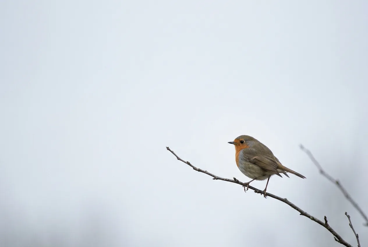
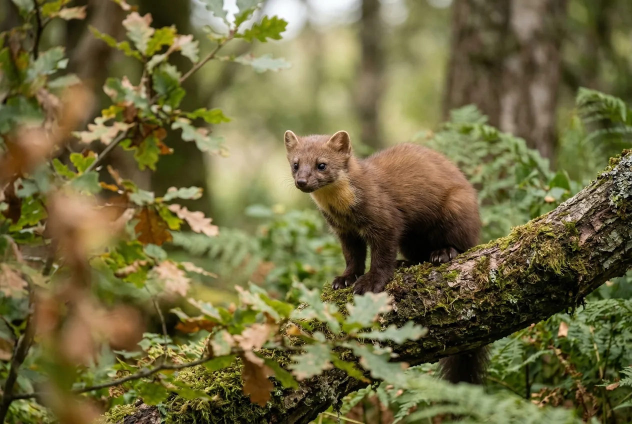
If you've read one composition tip, it's the rule of thirds. Divide the frame into nine equal parts with two horizontal and two vertical lines, and place your subject — or, for an animal, its eye — on one of those lines or where they cross. It's not magic and it's barely a rule. What it does is talked about better than it's usually explained: it creates "a sense of balance — without making the image appear too static — and a sense of complexity — without making the image look too busy".
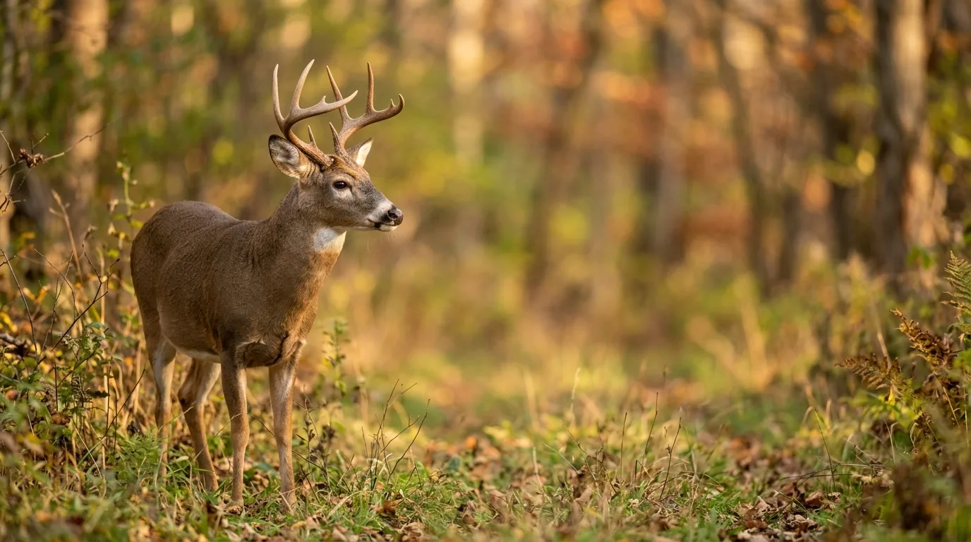
The practical payoff is that it breaks you of the beginner reflex to center everything. "A centered subject with equal space on each side looks lost," and it draws the eye toward the dead space instead of the animal. Worse, centering everything makes all your photos look the same. Pulling the animal off to one side gives the frame direction — a bird placed on the left third reads as if it could lift off to the right at any second.
But the rule of thirds is a starting point you outgrow. Follow it slavishly and "your wildlife images can quickly become boring and predictable". Plenty of pros place the subject a little closer to center than the strict intersection, depending on the background and the animal. The grid is training wheels for your eye — useful until placement becomes instinct, then mostly ignored.
The rule of thirds is training wheels for your eye: useful until placement becomes instinct, then mostly ignored.
The eye, the sharp eye, and the connection
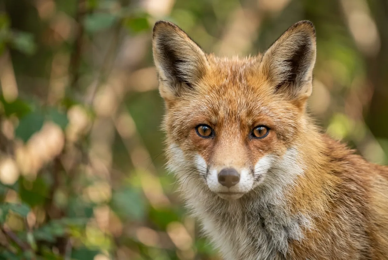
We are hardwired to look at eyes — an animal's or a person's. It's the first place a viewer's attention lands, and "the viewer of your image will immediately lose interest if the eyes are out of focus". So the eye must be critically sharp, every time. Not "acceptably" sharp — biting sharp. Steve Perry, who's about as exacting as wildlife shooters get, wants eyes "so sharp I can make out the little capillaries".
Here's the single most useful technique in this whole piece, and almost nobody does it at first. The common mistake is to slap your center focus point on the eye and fire — which leaves a pile of dead space above the animal and chops its body off at the bottom, forcing a corrective crop. The fix is to flip the order: compose the frame you want first, then move your active focus point onto the eye. Modern cameras with dozens of points, or full-frame eye detection, make this easy; you stop letting the focus point dictate your composition and make it serve you instead.
A few field notes that save frames:
- Watch your depth of field on the face. When an animal looks straight at you, or has a long snout or beak, the nose or bill can fall out of focus while the eye is sharp. Stopping down to roughly f/11–f/13 brings the whole face in; alternatively, keep it shallow and let only the eyes be sharp — the picture still works as long as those are crisp.
- A turned-away animal can still work — if the eye is sharp. Even when the animal isn't looking at you, that visible eye has to be tack sharp or the frame falls apart.
- Eye contact is a gift, not a guarantee. When the animal does look into the lens, it "creates a deeply connected emotion… drawn into it like a magnet". You rarely get to ask for it. So dial in your exposure on test frames while you're still at a distance, then close in quietly so you're ready when the moment comes.
Where you place that eye is a composition choice in itself. When an animal looks straight down the lens, putting the eyes a little above the center line with even space left and right makes it feel like you and the subject are meeting as equals; placing the eyes higher in the frame makes the viewer feel they're looking up at the animal, which reads as dominance.
Lead room: give the animal somewhere to look
This is the one that instantly separates a thinking photographer from a snapshooter. If an animal is looking, walking, or flying in a direction, leave more space in front of it than behind. Frame a bird flying left-to-right hard against the right edge and it looks like it's about to slam into the frame; give it room ahead and it's flying into the picture, with somewhere to go.
The reason this works is that the viewer's eye follows the subject's gaze. We look where the animal looks. So a fox on the left of the frame looking left leads your eye straight out of the picture; the same fox looking right pulls you back into it. Space in the gaze direction lets the viewer "imagine the rest of the scene" — the prey it's watching, the perch it's about to leave.
Like every guideline here, it has a deliberate exception. Sometimes you cut the space ahead on purpose to tell a different story — one photographer framed a heron with less room in front specifically to say the bird had just taken off, "leaving the rock behind". The point isn't "always leave space ahead." It's: decide what the space is doing.
We look where the animal looks — so leave space in the direction of the gaze, and the viewer's eye follows the animal into the frame.
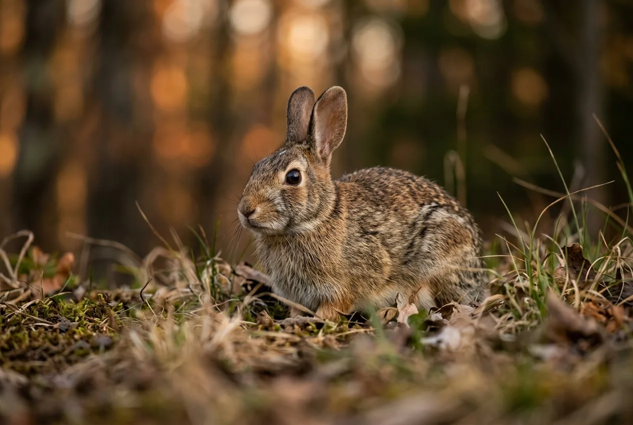
Get low: the eye-level shift that changes everything
If I could make every new wildlife photographer change one habit, it would be this: stop shooting down. Most animals are shorter than you, so the lazy default is to point the lens down from standing height — and it quietly ruins photographs in three separate ways. Drop to the animal's level and you fix all three at once.
It changes the emotional read. Shooting down on an animal "creates a feeling of superiority in the image" and makes the subject look small and vulnerable; getting to its level "helps put you in their world". A low viewpoint gives the subject significance and a stronger connection with the viewer — the same octopus looks weak photographed from above and powerful shot from its own level.
It fixes your focus plane. At eye level, your sensor sits parallel to the most important plane of the subject — the eyes and as much of the body as possible — so all of it falls at the same distance and stays sharp. As Steve Berardi puts it, "in every photo, there is really only one plane of complete sharpness," and eye level is how you spend it wisely.
It cleans up the background for free. Shoot down and the background is the ground right behind the animal — too close to blur, full of clutter. Get low and the background becomes whatever is far away behind the subject, which is easy to throw out of focus. There's real geometry here: standing over a low subject, your line of sight "falls shortly after the subject," so the background is right there; drop to its level and your line of sight runs past the animal so "the theoretical background falls almost to infinity," and you can even shift sideways to pick a cleaner backdrop.
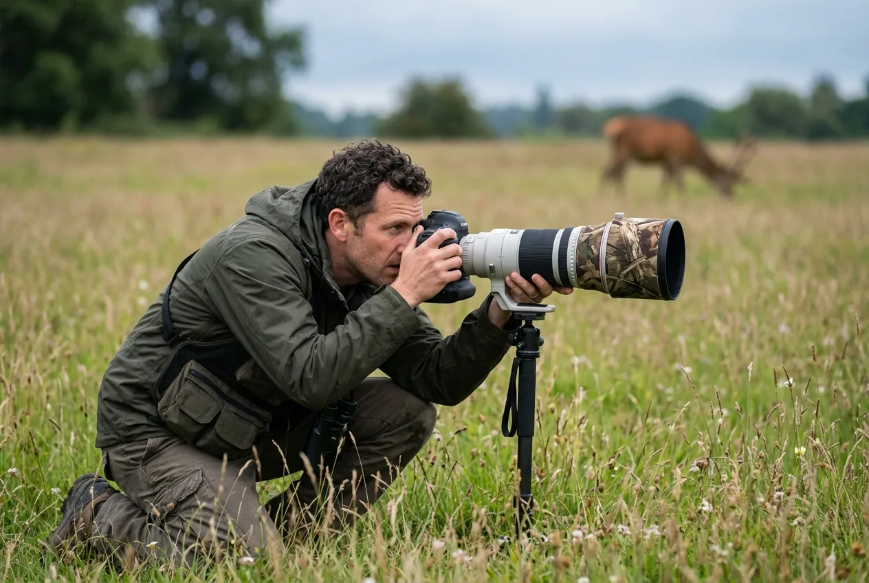
Yes, it means lying in the dirt. "You're not going to achieve an amazing image by keeping your clothes clean," as one National Geographic pro bluntly says — sometimes you crawl in the mud and worry about laundry later. When you genuinely can't get low — an animal up a tree, a bird on a cliff — backing well away flattens the angle and gets you closer to eye level than standing right under it would. And take a safety shot from standing before you lower yourself, because the movement of getting down can be what flushes the animal.
Backgrounds: win them with your feet, not your aperture
Ask experienced wildlife photographers what makes or breaks a shot and a startling number say the same thing: the background. "As meticulous as one can be in composing a perfect subject, if the background isn't treated with equal care, the end result will not be successful". The classic disaster is the branch or post growing out of the animal's head — but distractions are often subtler: a bright blown-out patch, a hard line, a streak of light through trees.
The instinct is to fix backgrounds with a wide aperture and a long lens, blurring everything to mush. That's part of it, but it's not the heart of it. The real move is position. "In most cases, the photographer found the angle that made this harmony work rather than chance upon it," and "frequently a small shift in camera position of just a few inches" turns a chaotic background into a clean one. Move left, move right, raise or lower your tripod, and watch the background change behind the animal before you ever touch a setting.
The mechanics that make a background go soft are worth knowing, because they tell you where to stand. Two distances do most of the work: how close you are to the subject, and how far the subject is from its background. Get one of them right and the other matters less — if you're very close to the bird, it barely needs to be far from its background; if you can't get close, you need much more distance behind it. Angle matters too: even with a clean, distant background, shooting down at an animal collapses the separation, because the only thing behind it is the ground a few feet back. Getting lower "increases the separation dramatically".
A field checklist that costs nothing:
- Scan the whole frame, especially the edges, before you fire. When you fill the frame it's easy to fixate on the subject and miss what's creeping into the corners.
- Use distance and focal length deliberately. A 50mm lens takes in roughly four times the background area of a 200mm at the same subject distance — a longer lens simply shows less background to go wrong, and gives you more working distance so you don't crowd the animal.
- Let the weather help. Fog, mist, and rain wash the background into a clean wash of tone and hide clutter that a clear day would show; one photographer waits for sea mist to make distracting cliffs disappear behind a puffin.
- If you can't fix it, go tight. When no angle gives you a clean background, fill the frame with the animal so the background barely exists.
Negative space: when emptiness is the point
Negative space is everything in the frame that isn't the subject — the sky, the water, the out-of-focus ground, the visual "breathing room" around the animal. It's not dead area you failed to fill. Used well, it's one of the most powerful tools you have, and the case for it goes well beyond photography: in design and film it's the deliberate emptiness that simplifies an image, gives the eye a place to rest, and makes the one thing in the frame impossible to ignore.
Three jobs negative space does for a wildlife frame:
It makes the subject stand out. Surround a small animal with emptiness and the eye has nowhere else to go. Photographer Romanas Naryškin's image of it is perfect: hand someone a white sheet with a single ink spot, and "what will you immediately notice? The ink spot" — and suddenly that spot has a story. Counterintuitively, as the subject gets smaller in the frame, a viewer's curiosity often grows.
It conveys scale and mood. A lone animal dwarfed by empty habitat reads as solitude, vastness, or vulnerability in a way a frame-filling close-up never can. A puffin against open sky and sea stops being "a record shot of a puffin" and starts asking questions — where has it been, where is it going.
It balances the picture. Negative space has visual weight, and you can use it to counterweight the subject. The relationship isn't one-to-one: "lots of negative space can balance out just a little positive space," because the subject is powerful and the emptiness is quiet. Some photographers keep a rough two-parts-empty-to-one-part-subject ratio in mind — useful as a guideline, not a rule. Just make sure the emptiness is earning its place: a big blank area with no purpose is a weakness, but the same space "produc[ing] a sense of place or creat[ing] a mood" is a strength.
Negative space isn't the area you failed to fill — it's the silence that makes the subject impossible to ignore.
Lines, framing, and the rule of odds
A handful of supporting tools, each worth a beat.
Leading lines are anything in the scene that guides the eye toward the subject — a river's curve, a fallen log, a fence, the path an animal walks. They usually run from the foreground into the frame and should point at the subject; a line that leads away from the animal works against you. They can come from the animals themselves, too: a row of elephant trunks against the sky, or out-of-focus animals decreasing in size, can form a natural arrow to your main subject. Horizontal lines feel calm, vertical lines add tension, and curves "add magic" and flow. One caution worth remembering: avoid an obvious line that runs straight behind the animal's head, which muddles its shape.
Natural framing uses elements in the scene — overhanging branches, foliage, a gap in the grass — to surround the subject, adding depth and pushing attention inward. Shooting through out-of-focus foreground does double duty: it frames the animal and hides distractions. Photographer Kevin Morgans builds foreground "mush" by shooting low through vegetation at a wide aperture, and once built a snow mound between himself and a resting hare just to blur away distracting dark heather in front of it.
The rule of odds says a group reads better with an odd number of subjects — three, five, or seven rather than two or four. The reason is tidy: faced with an even number, our brains pair them off neatly, but an odd number resists grouping, so the eye lingers and one element tends to dominate. With wildlife you rarely control the count, but you can sometimes frame or crop to an odd number. And like every rule here, it bends — you don't leave a face off a family group to satisfy it.
Watch your edges and tangencies. A "tangency" is when two shapes just touch in a way that nags — a blade of grass running from a rock right into a fox's head, an antler tip kissing the frame edge. They're easy to miss in the moment and obvious in the final image. A quick scan of the viewfinder, and a small move of your feet, kills most of them. The same scan catches the other common error: clipping feet, tails, or wing tips. When an animal's legs are hidden behind grass, leave room at the bottom so the viewer senses where the feet are rather than feeling them chopped off.
Portrait or environment? Decide what the picture is about
This is the biggest creative fork in wildlife photography, and the most prestigious competition in the field draws the line cleanly. Wildlife Photographer of the Year separates Animal Portraits — "revealing the personality of an individual… in a thought-provoking or memorable way" — from Animals in their Environment — "evoking atmosphere and a sense of place, with the habitat as a major element of the picture, to convey how an animal is an integral part of its environment". Two different goals, two different ways to compose.
The classic field wisdom for working both is the "push/pull." Don't shoot tight with a long lens all the time, says veteran National Geographic photographer Robert Caputo — "you need to show their environment too. Habitat says a lot." His wide shot of Cape buffalo tells you they live in big groups, that the land is dry, that they come to water — context a close-up can't carry; then he reaches for the tight shot to show personality. A wide-angle frame of a tolerant animal in attractive surroundings often has more impact than the same subject shot tight, precisely because it shows where the animal belongs.
So which do you choose? Often the light and the background decide for you: good light on the animal and a messy background argues for a tight portrait; a gorgeous, complementary background argues for going wider — and when you can, shoot both and choose at home. The deciding question isn't "close or wide" in the abstract. It's: what is this photograph trying to say about this animal?
Breaking the rules — on purpose
Every guideline in this piece earns its keep, and every one of them is meant to be broken when breaking it makes the picture stronger. That's not a contradiction; it's the whole game. The pros are blunt about it. "My main rule is that there are no rules," says award-winning bird photographer Carolina Fraser. "Learn the rules so that you can decide when to break them". The key word is purpose: "purposefully composed photographs are the strongest ones," and breaking a rule only works when you have a reason.
Center the subject — the cardinal sin of the rule of thirds — and it's exactly right when you want to emphasize symmetry, confront the viewer, or fill the frame with leading lines that converge on a dead-center animal facing the lens. Bury a subject tiny in a sea of empty space and you've broken "fill the frame," but you've made an image about scale and solitude. Crop the looking-space away and you've told a story of departure. The move that separates this from sloppiness is the one Christine Hauber recommends: shoot a few frames that follow the rule and a few that break it, so the choice is yours and you can see which says more.
If there's a meta-rule, it's the one William Majoros offers for birds and it applies to everything: stop "rationalizing with canned rules" and let your visual sense tell you what looks right — our brains are very good at noticing when something's out of balance. The guidelines exist to train that sense. Once it's trained, you trust it.
Learning from the images that win
One of the fastest ways to improve is to study photographs that work and ask why they work. Award-winners say it constantly: study images, and study paintings too, even ones with nothing to do with wildlife, and figure out what makes the composition strong. The category definitions from Wildlife Photographer of the Year double as a composition syllabus — portraits, animals in their environment, behavior, natural artistry, urban wildlife — each one a different problem to solve in the frame. When you look at a winning frame, trace it: where's the eye, where's the subject in the rectangle, what's the background doing, where did the photographer have to be standing to get that angle? That last question — where were they standing — answers more than any settings readout ever will.
Frequently asked questions
What is the most important rule in wildlife photography composition?
There isn't a single one, but if forced to pick: get the eye sharp and make eye contact when you can, because that's where the viewer looks first and it's what creates the connection. Close seconds are getting to eye level and placing the subject off-center with room to look into.
Should I always use the rule of thirds for animals?
No. It's a useful starting point — especially for breaking the habit of centering everything — but following it on every frame makes your work predictable, and plenty of strong images center the subject or place it elsewhere on purpose. Use it until off-center placement becomes instinct, then trust your eye.
Why do my wildlife photos look flat or boring even when they're sharp?
Usually it's the angle and the background. Shooting down from standing height makes animals look small and parks clutter right behind them; getting to eye level adds intimacy and lets the background fall away into a clean blur. Check that you've left the animal space to look into, as well.
How do I get those smooth, clean backgrounds?
Mostly with your position, not just your aperture. A shift of a few inches, or getting low, can swap a messy background for a clean one; then add distance between the subject and what's behind it and use a longer lens, which shows less background. Misty or overcast weather makes it far easier.
When should I fill the frame versus show the animal in its environment?
Decide what the picture is about. A frame-filling portrait reveals character and detail; a wider, habitat-rich frame conveys a sense of place and how the animal lives there. Let the light and background guide you — and when you can, shoot both and choose later.
What's "lead room" or "looking space"?
It's extra space left in the frame in the direction the animal is facing or moving. Because viewers' eyes follow the subject's gaze, that space lets the animal look or move into the picture instead of out of it, and invites the viewer to imagine what happens next.